The Only 6 Colors You Need for Colorful Abstract Painting
Want to learn how to mix every color of the rainbow with only a few key art supplies?
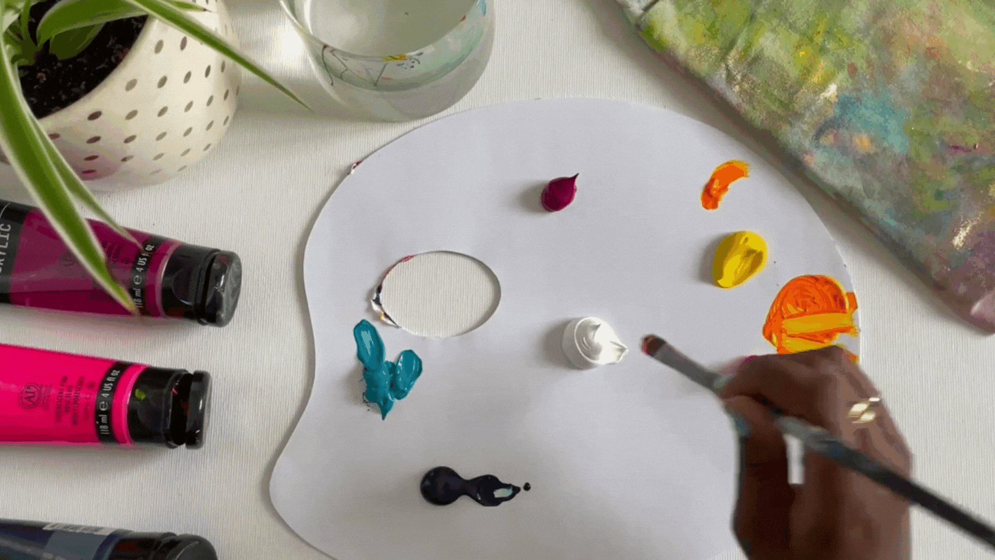
Here’s a fun fact – you actually only need six main colors to create a stunning array of vibrant hues in every shade and tint! I am an abstract artist and surface designer specializing in bright, colorful pieces that inspire joy. Here are the exact colors I use to create my pieces.

This post contains affiliate links which means that if you purchase any of the supplies I recommend I will make a small commission at no extra cost to you.
If you want the short version, the colors are:
Read on to learn how I mix these colors and use them in my paintings!
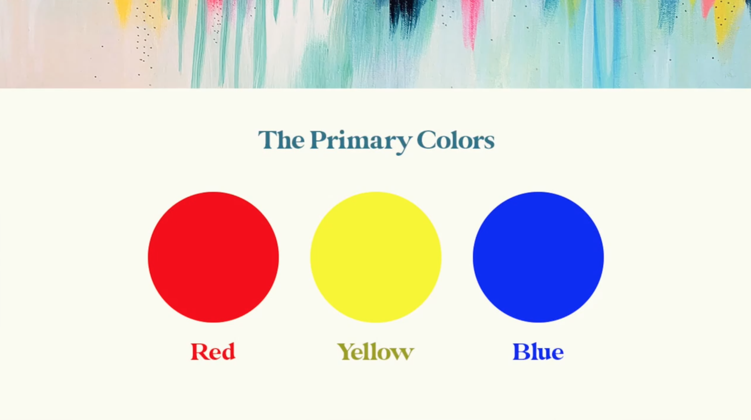
Primary Colors
The primary colors (aka the colors that can be mixed together in various cominations to make the colors of the rainbow) are red, blue, and yellow.
But you may have noticed that I don’t have red or blue in my list of recommendations. The reason for that is that someitmes the true primary colors can come out dull and muddy when mixed. I’ve found that using jewel-toned nontraditional primary colors like Quinacridone Magenta for red and Turquoise Blue for blue results in much better mixes and less muddy colors.

Other Helpful Colors
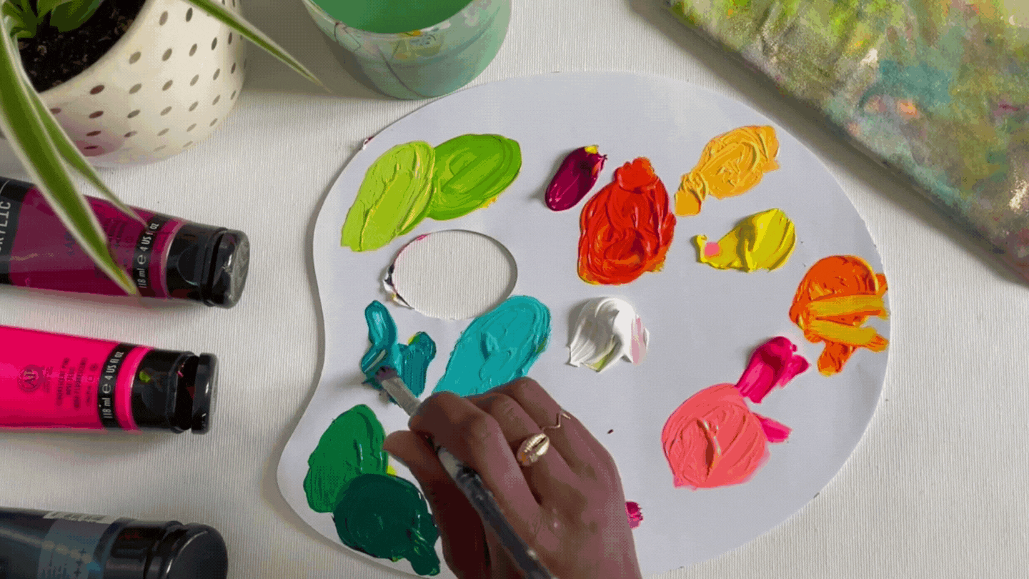
The primamry colors are great for making every color of the rainbow, but what if you want to lighten a hue, darken it, or make it more vibrant? That’s where my second set of three colors comes in. These are more neutral colors that help to change the tint of a hue.
My second set of colors include:
Now you may be thinking, Fluroescent Pink?? How does that fit into the “neutral” category? I’ll go over each color and share what I use them for next.
Quinacridone Magenta
This serves as my primary red. I love magenta because it’s dark enough to provide the richness you need from a primary color, but it doesn’t make muddy purples or oranges when mixed.
Plus it’s gorgeous on its own! Pink hues are a staple in my paintings, and they’re often hard to mix. This magenta is one I use all the time both on its own and as a primary color!

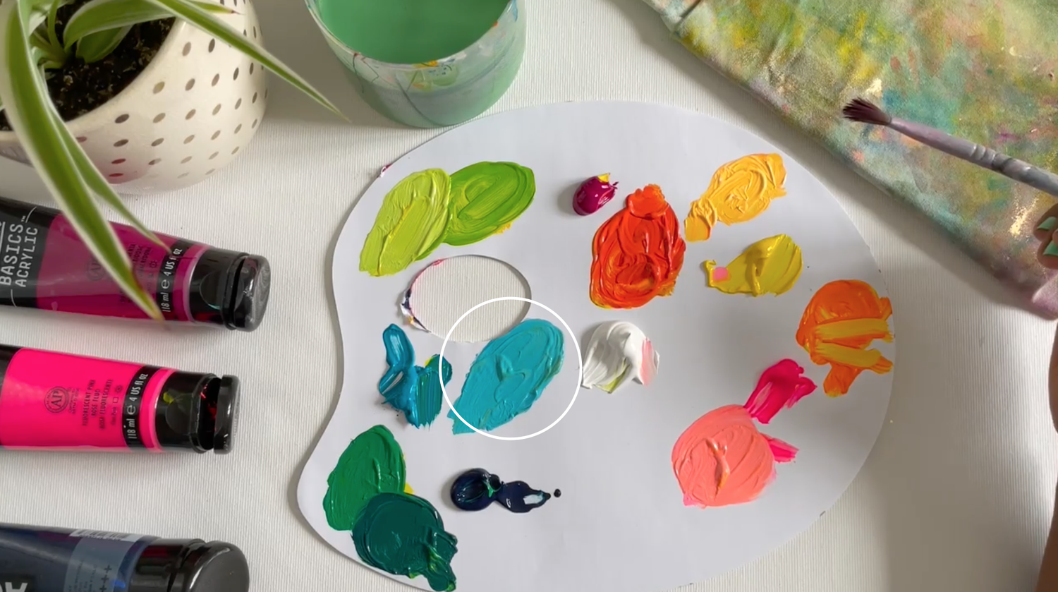
Turquoise Blue
Turquoise serves as my primary blue. Similarly to magenta, it has some extra warmth to it and is beautiful to mix with. It makes the most stunning jewel-toned greens!
Again, this color is also beautiful on its own. It’s also so beautiful when mixed with white. It creates the perfect Robin’s Egg Blue!
Primary Yellow
Primary Yellow does what it says on the tin. It’s the perfect yellow to mix with my nontraditional primary red and blue. It helps keep things vibrant and bright.

Titanium White
White is an essential color to have in any paint kit. It is a staple for me since it’s the key to lightening up your colors. When I paint abstract compositions, it’s essential to have a variety of dark and light hues to give the piece contrast and movement. You can’t go wrong with a solid titanium white paint for lightening any color!
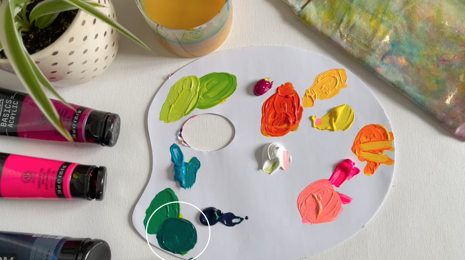
Prussian Blue
But what if you want to go darker? Traditionally artists darken things using either black or a complementary color to the one they’re painting with. However, I find that avoiding black and muddy complementary colors is best when painting vibrant abstracts.
If I do want to darken a piece, I use Prussian Blue. This showstopping color works great both on it’s own and when mixed with colors to make them darker. Just be careful – a little goes a long way here! If you’re mixing it in with other colors to darken them, make sure to add a tiny bit at a time to learn how much works for you style and preference.

Fluorescent Pink
Now for the most important color – Fluorescent Pink! This color is going to change the game for you if you are struggling to make vibrant artwork.
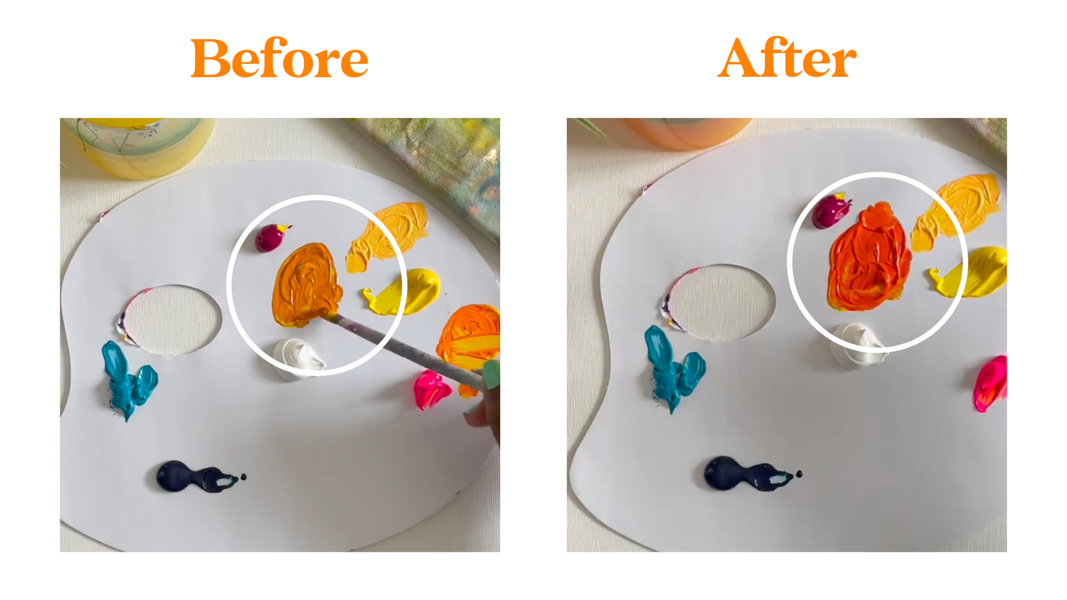
I mix Fluorescent Pink with almost everything to help give it a pop of vibrancy. Take this orange for example, when I mix Quinacridone Magenta and Primary Yellow, I get a marigold color. This is beautiful as it is, but if you want to make it a little more vibrant, all you have to do is add some Fluorescent Pink!
The only color that you can’t mix well with Fluorescent Pink is green. Green and red are complementary colors which means they turn black when mixed together. Even though Fluorescent Pink is extremely vibrant, it’s still in the complementary family to green. This means when you mix it with green it will bring some darker, muddy vibes to the mix. And that’s not what we’re going for!
Stick to mixing Fluroescent Pink with anything you would otherwise mix with red, and you’ll be good to go. In this blog post I share more about my love affair with Fluorescent Pink. I go over different colorful palettes you can create to incorporate hot pink seamlessly into your compositions.
Want a step-by-step walkthrough of how to mix any color you want with these six main colors? Check out this post next to learn vibrant color mixing with acrylic paint!
xo,
Jessi

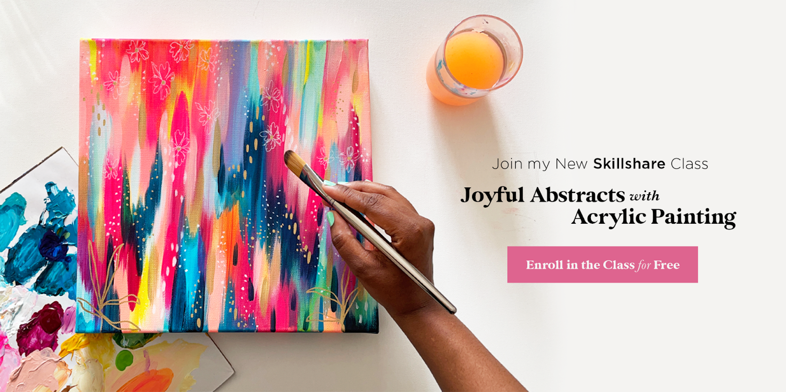
Want to learn how to paint an abstract painting with these beautiful colors?
Join me in my Skillshare class, Joyful Abstracts with Acrylic Painting! In this class I share my step-by-step painting process. I’d love for you to join me and create your own Joyful Abstract! If you’re new to Skillshare you can enroll in the class for free! Plus you’ll get a free month trial of Skillshare so you can check out all of the amazing creative classes on the platform.
Pin this post for later! 📌
Hover or tap on this image and click the “Save” button on the top left!
