Hot Pink Color Palette Inspiration for Artists
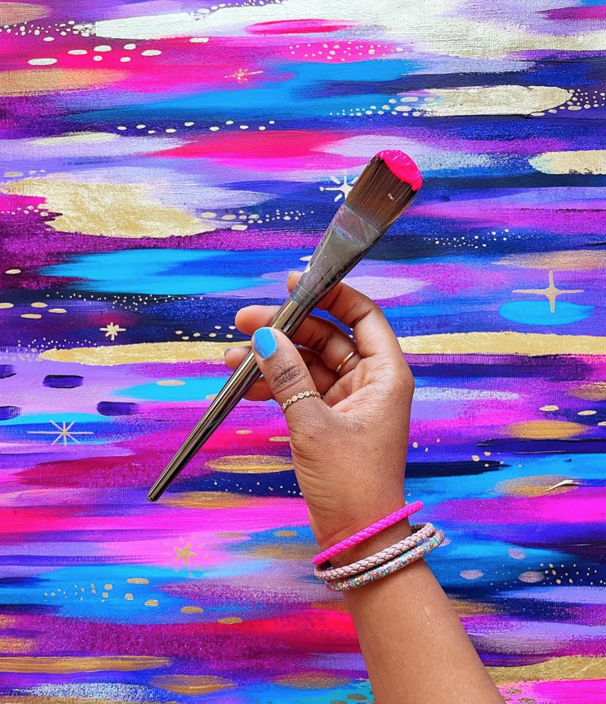
In this post, I’m going to share some of my favorite color combos to use with my favorite paint color - fluorescent pink! These hot pink color palettes are tried and true, so if you’re not sure what colors are complementary to pink, you’ll want to read on!
If you’re familiar with my work, you know that I add a pop of fluorescent pink into almost all of my fine art paintings. You’ll also find it in my digital work and surface designs.
If you’re curious, here are my recommended supplies including paint brands! Now, let’s dive in and talk about my go-to hot pink color palettes!
Quick Color Theory Overview
I won’t dive into too much color theory in this post, but we’ll touch on it since it’s what will help you determine which colors work well together.
If you already have a good grasp on color theory, you can skip to the next section!
All of the colors of the rainbow can be mapped out in a color wheel which shows how the colors relate to each other. In color theory, we start with the primary colors - red, blue, and yellow. When these colors are mixed together in different combinations, they make secondary colors (aka the remaining colors of the rainbow).
The color wheel helps us determine which colors work well together based on where they are in relation to others on the wheel. I’ll share more about how certain colors relate to each other as we go through the different color palettes.
Hot Pink Palette #1 - Analogous Colors (Purple and Blue)
One of my go-to color combinations to use with hot pink is what’s called an analogous color palette. This is just a fancy way of saying “colors that are next to each other on the color wheel.”
Hot pink, purple, and blue are all next to each other, so I know that this will make a harmonious color palette.
The best part is that blue and purple tend to be darker and cooler than hot pink, so when they’re paired together it gives the fluorescent pink a chance to truly pop and shine!
Hot Pink Palette #2 - Complementary (Mint Green)
Another tried and true way to make a harmonious color palette is to use complementary colors. This simply means colors that are across from each other on the color wheel. Complementary colors are successful because they are naturally pleasing to the eye. They are different enough to provide interesting contrast, but similar enough to not feel jarring when paired together.
Complementary colors are:
Red and Green
Blue and Orange
Yellow and Purple
So you may be thinking, “What is the complementary color to pink? It’s not listed here!” Pink is just a different shade of red, so its complementary color will be anything in the green family.
One of my favorite complementary colors to use with pink is a minty green color. It brings a softer edge to the piece and helps the pink pop!
Hot Pink Palette #3 - Rainbow!
I just had to include this one! If you know me, you know I often paint my pieces using an entire rainbow of colors. When you’re painting with bright, vibrant tones, they will naturally complement the vibrancy of fluorescent pink.
If you want to learn how to mix a rainbow of vibrant colors using my favorite nontraditional primary colors, I have an entire blog post about that here!
Now, sometimes rainbow palettes can have the tendency to have a kind of youthful vibe. This is great if that’s what you’re going for! But the key to making a rainbow palette feel elevated and sophisticated is to add some grounding colors that anchor the piece.
I often choose darker or more muted colors to help ground my pieces. In these examples you’ll notice that I use colors like forest green, prussian blue, and quinacridone magenta to level out the vibrancy of the artwork.
I hope that these pink color palettes will help spark some inspiration so you can create your own fluorescent pink masterpiece!
xo, Jessi
If you want to learn how to paint an abstract piece featuring fluorescent pink, join me in my online painting class, Joyful Abstracts, where I teach my painting process from start to finish. The class is available on Skillshare, and you can watch it (and thousands of other creative classes) for free when you sign up for a free month-long trial!
Pin this post for later! 📌
Hover or tap on this image and click the “Save” button on the top left!


